Into the future, respecting the past.
Please excuse the ramblings of a visual communicator, especially of one that is quite unaccustomed to using words to describe what has been done. I’d much rather show you but as humans love a good story, I’ll give it a go.
The recently published NZPB magazine was the first tangible expression of a two-year long process of rebranding our Association, the RNZPBA website being the second. I use “our” because over the past two decades I have come to deeply value my connections to New Zealand. It’s peoples, cultures, it’s breath-taking natural beauty and that underlying Kiwi drive to just be better human beings.
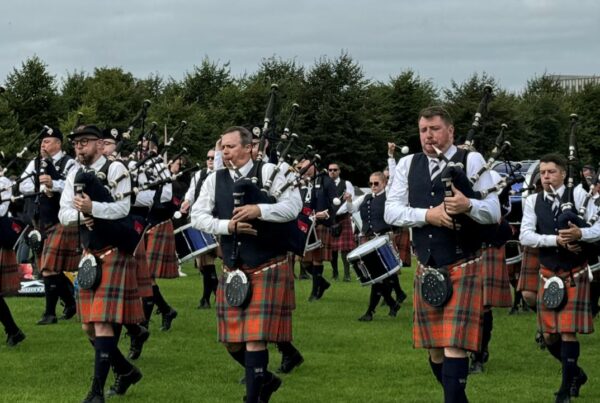
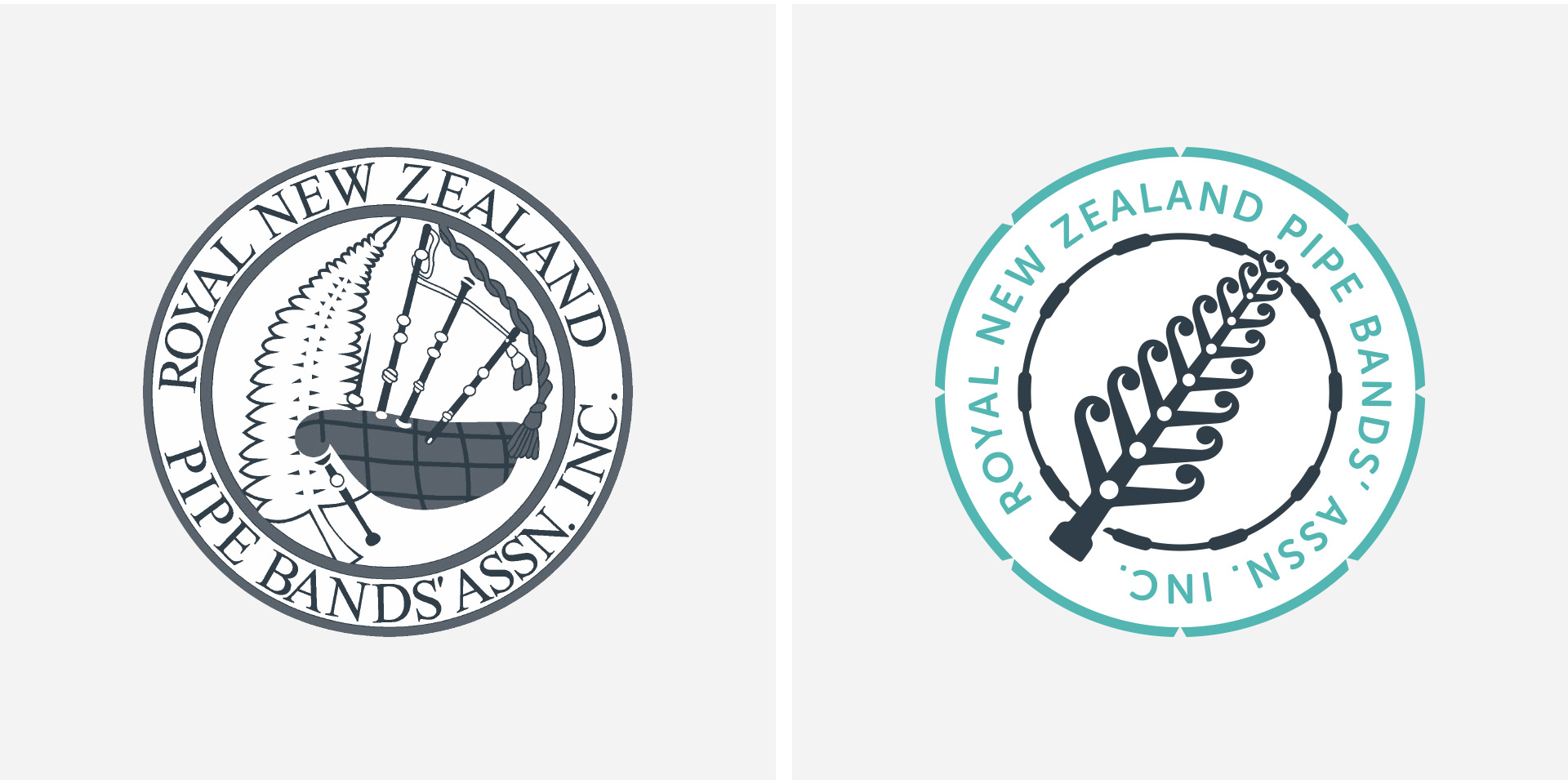
Having observed the RNZPBA’s efforts in the recent past to increase the awareness of our artform to both its internal and external audiences, I felt that it could be better served with a more robust brand with world-class visual tools to amplify these efforts. I started by doing some desk-top research of other associations, affiliations to the artform like highland dancing and highland games, and even individual band identities, and it became apparent that the RNZPBA was pretty much swimming the same strokes as other folks. The only difference being the provenance implied by the silver fern. I then roughed up some thoughts and created a presentation which I sent off as a conversation starter.
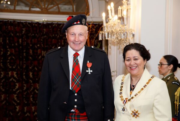
That conversation began in earnest a year later as Allister Macgregor assembled a working group comprising myself, himself, Stu McHale (as lead) and Chris Stevens. I took them through my initial thoughts and how I believed that with some effort we could collectively change the way the RNZPBA represents itself to its community and the world at large. The timing was perfect. The ‘I’ in this article has now become the ‘we’.
This is a perfect segue into what we have done. But, before we address the rebrand, I guess we should get some jargon out of the way. What is a brand? Well, this is a difficult one. I can tell you what it isn’t though. It’s not a logo, neither is it a product. It is a feeling felt in the gut of a consumer. And since we all have different feelings, and guts for that matter, a brand is a very difficult thing to make tangible. What we can do is support our brand with all kinds of visual tools. A logo, a colour palette, a tone-of-voice, a particular typeface, a treatment of visuals – to make them unique and different. All these come together to form a sort of visual language which amplifies our visibility. This visual language is then applied across a variety of media, both tangible and digital, and if applied with consistency over time we create trust with our consumer. Once we have their trust however, we break it at our peril. We have now moved into the world of building reputation.
So in a nutshell, Brand Strength = Reputation x Visibility.
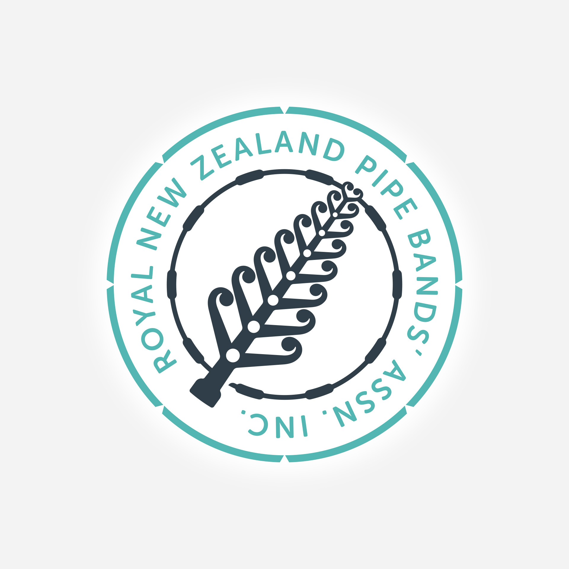
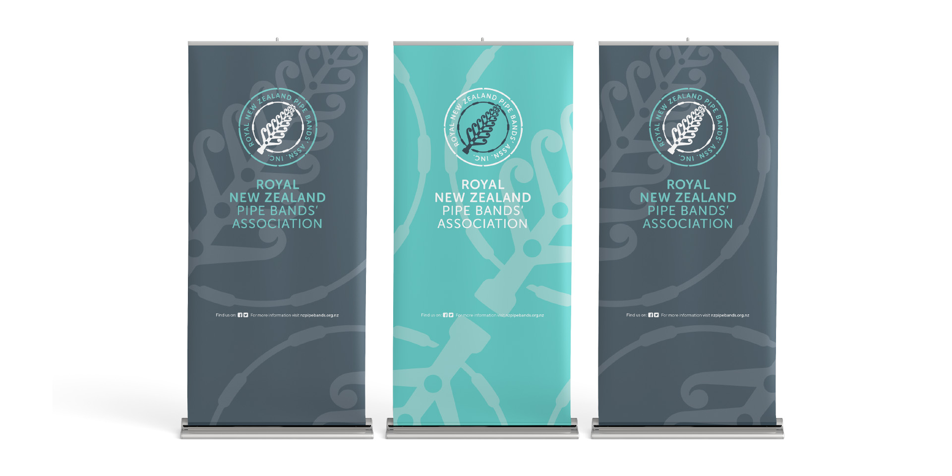
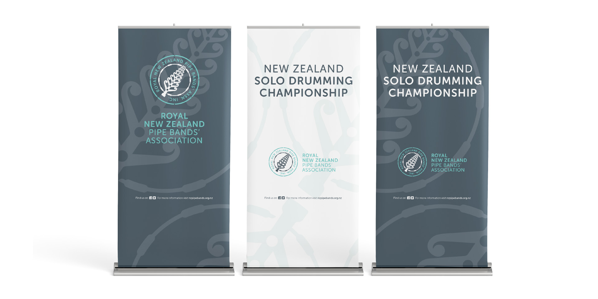
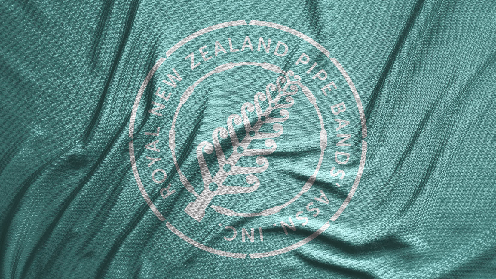
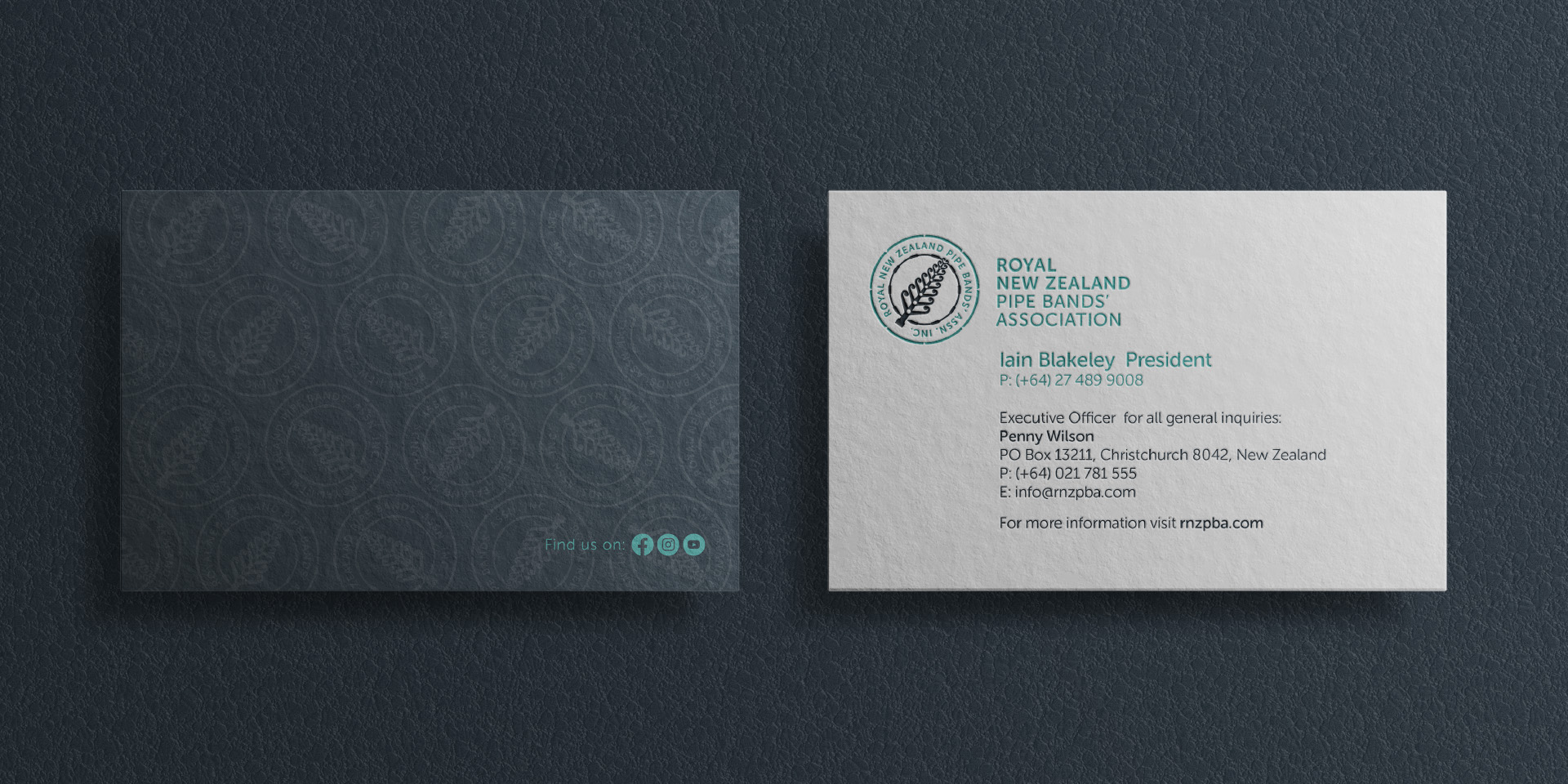
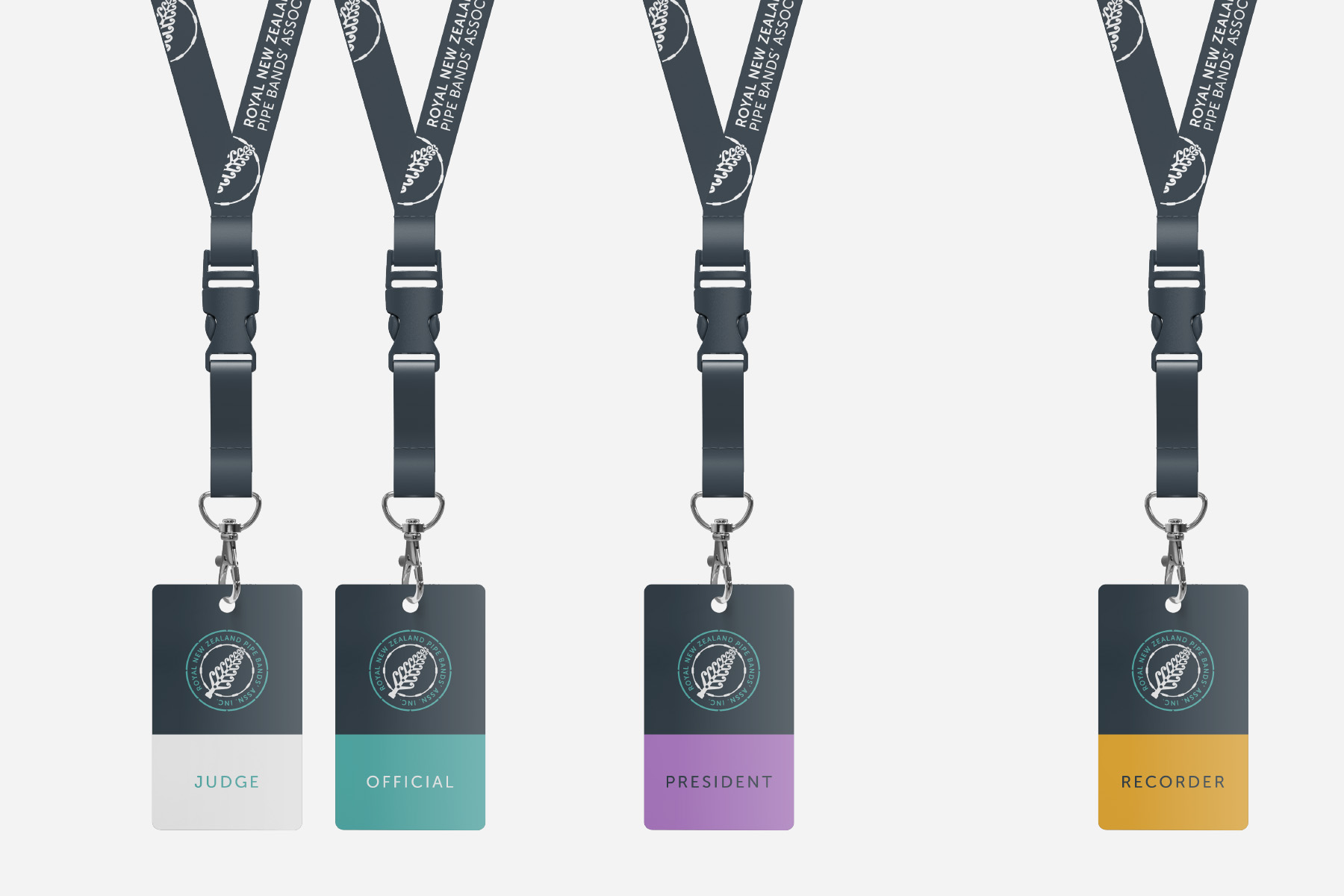
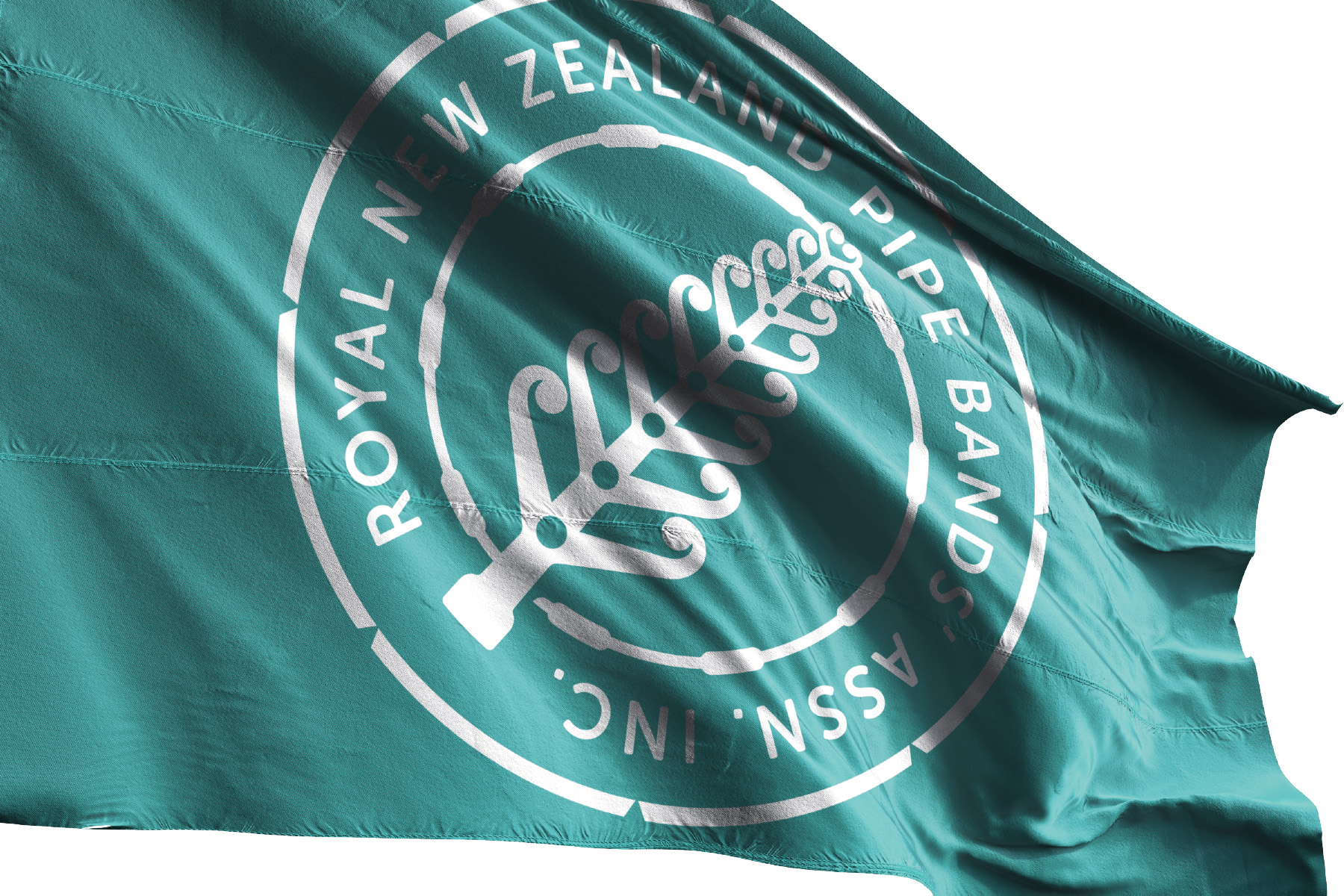
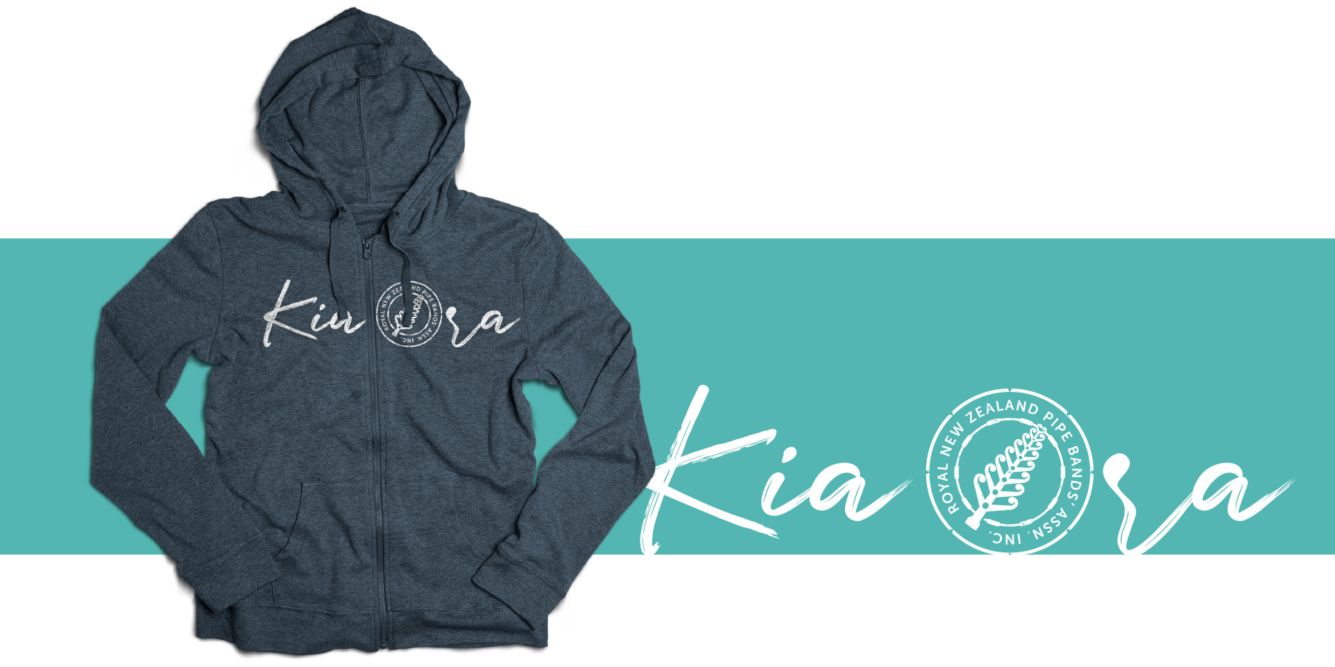
Now let’s go through each of the visual tools beginning with the brandmark. Early in the development phase it was determined that an evolutionary approach would be the best solution. That way we could build on some of the reputation already inherent in the arrangement of elements. A decision to combine the silver fern and the pipe chanter proved to be a breakthrough allowing for a simpler arrangement of the two main elements of the existing brandmark. Inspired by strong Māori graphic motifs the fern is at the point of unfurling, implying a new beginning and underpinning the idea that the Association is committed to the development of its youth and learners. The fern is surrounded by a simplified graphic of a drum-head and together with the outer ring form a contemporary ‘belt’ motif containing the Associations’ name. The outer ring is deliberately split into segments symbolising the individual Regional Centres. The combination of all these elements tightly arranged in a strong circular shape translates well in the ‘digital-first’ world we live in.
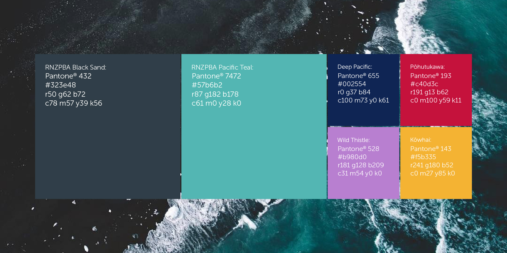
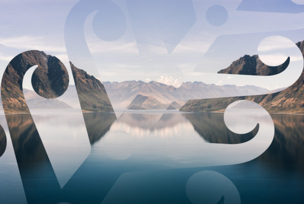
The next element to define our visual language is the colour palette which is inspired by the unique meeting of turquoise waters and dark volcanic beaches. The colours, Black Sand and Pacific Teal are the primary brand colours and are the first real clue of a break from the past. The primary colour palette is in turn supported by a secondary one, drawing from the provenance of New Zealand. Colours like Kōwhai, Pōhutukawa, Wild Thistle and Deep Pacific will be used to enhance the brand and create visual relief as well as differentiation when supporting programmes like The Summer School, which relies on Kōwhai as its primary colour.
The next arrow in our visual language quiver is typography and we have selected a modern typeface family called Museo. It is a versatile family with a range of weights and styles, allowing for versatility and practicality. It will become the backbone of all our communication as the brand matures over the next year or two. Finally, our brand is supported by an image bank which celebrates the natural wonder of New Zealand. We have come to appreciate that whilst our primary audience remains proudly New Zealander, the world is keen to see what we have to offer. And by our reckoning, that’s a lot.
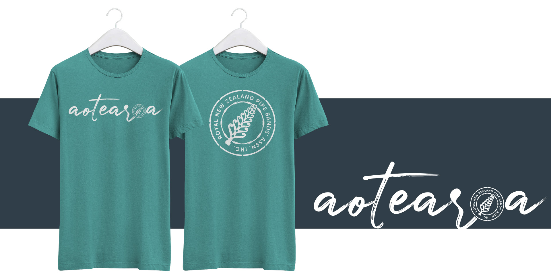
Over the next year you will see new and exciting expressions of our brand as we continue a phased roll-out. We have been very careful to attend to all of the touchpoints, from stationery to websites, and from presence branding at events to branded collateral and apparel. It truly is an exciting time for us.
In closing, we hope that you embrace the change, despite the shock of the new, and adopt and protect this brand as it develops and evolves over the next few seasons. We hope that in time you are as proud of it as we have become.